What IELTS Writing Task 1 Academic Actually Is
Most beginners approach Task 1 as a description exercise. They look at a graph, they name what they see, they write numbers, and they call it done.
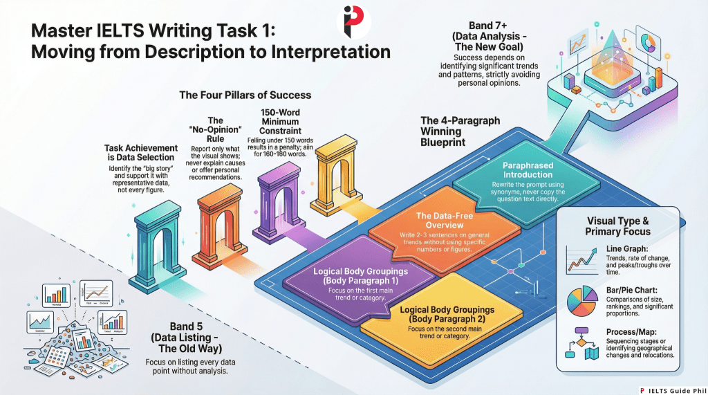
That approach produces Band 5.
Task 1 Academic is not a description exercise. It is a data interpretation and reporting task. The difference between those two activities is the difference between a candidate who lists every number on a graph and a candidate who identifies what those numbers mean in relation to each other — which figures are significant, which trends are dominant, which comparisons reveal the most important story the data is telling.
Examiners are not impressed by a candidate who reproduces every data point. They are looking for a candidate who can look at complex visual information and communicate its key features clearly, accurately, and with appropriate academic language — in 150 words, in 20 minutes, without editorialising or speculating beyond what the data shows.
That is a specific, learnable skill. This post teaches it from the ground up.
The Basic Facts Every Beginner Must Know
- Word count minimum: 150 words. Responses under 150 words are penalised under Task Achievement.
- Recommended word count: 160 to 190 words. More is not better — quality of selection and language matters far more than quantity.
- Time allocation: 20 minutes out of the 60-minute Writing test total
- Weight: Task 1 carries less weight toward your overall Writing band score than Task 2
- What you are given: One visual — a graph, chart, table, diagram, map, or process illustration
- What you are asked to do: Summarise the main features and make relevant comparisons where appropriate
- What you must never do: Give your opinion, explain causes, or make recommendations
That final point is where a surprisingly large number of candidates lose marks. Task 1 is a reporting task. You describe and compare what the data shows. You do not explain why petrol prices rose in 2019. You do not recommend what governments should do about declining literacy rates. You do not express whether the trend is good or bad. The moment you editoralise, you have moved outside the task boundaries — and Task Achievement suffers.
The Four Assessment Criteria for Task 1
Task 1 is assessed on the same four criteria as Task 2, but the first criterion is named differently and functions differently.
1. Task Achievement (TA)
In Task 2, the equivalent criterion is Task Response. In Task 1, it is Task Achievement — and its requirements are specific.
Task Achievement asks: did you cover the key features of the visual accurately and relevantly? Did you include an overview? Did you support your points with data? Did you avoid irrelevant detail?
What hurts TA: omitting the overview, including every minor data point while missing the dominant trend, inaccurate reporting of figures, and offering opinions or explanations beyond what the data shows.
What helps TA: identifying and reporting the most significant features, writing a clear overview that captures the big picture without data, selecting representative data to support your key points, and staying strictly within the boundaries of what the visual shows.
2. Coherence and Cohesion (CC)
Your response must be logically organised and flow smoothly. In Task 1, this means a clear structural progression: introduction, overview, and body paragraphs that group related information logically rather than listing data point by data point in the order they appear on the graph.
3. Lexical Resource (LR)
Your vocabulary must be varied, accurate, and appropriate for an academic reporting context. This means using a range of language for describing trends (rise, increase, surge, climb, grow, decline, fall, drop, plummet, fluctuate, remain stable, plateau), making comparisons (in contrast, significantly higher than, approximately double, marginally lower), and describing data (account for, represent, constitute, stand at, reach a peak of).
4. Grammatical Range and Accuracy (GRA)
A range of grammatical structures is required. Task 1 provides natural opportunities for passive voice (sales were recorded, figures are shown), complex noun phrases (a sharp increase in enrolment), time clauses (between 2010 and 2015, there was), and comparative structures (considerably higher than, nearly twice as much as).
The Visual Types You Will Encounter
IELTS Academic Task 1 uses several distinct visual formats. Each requires a slightly different approach.
Line Graph Shows change over time. One or more lines tracking one or more variables across a time period. Your primary focus: trends — direction of change, rate of change, peaks, troughs, and comparisons between lines.
Bar Chart Shows comparisons between categories, often across time or groups. May be vertical or horizontal. Your primary focus: comparative sizes, rankings, notable differences or similarities between bars.
Pie Chart Shows proportions of a whole, usually as percentages. Almost always appears with a second pie chart for comparison (two different years, two different countries). Your primary focus: the largest and smallest segments, significant differences between the two charts.
Table Shows data in rows and columns across multiple categories and time points. The most data-dense visual type. Your primary focus: selecting the most significant figures rather than reporting every cell.
Process Diagram Shows how something is made, how a natural cycle works, or how a system operates. Unlike data visuals, process diagrams have no numbers or trends. Your primary focus: describing the stages, sequence, and transformations involved in the process clearly and accurately.
Map Shows a geographical area at two different points in time, or a planned development versus the current state. Your primary focus: what has changed, what has remained the same, and the nature of the changes (new construction, removal, relocation, expansion).
Diagram (Object/Structure) Shows how something works or is structured — less common than the other types. Your primary focus: labelling, function, and the relationship between parts.
The Overview: The Single Most Important Paragraph in Task 1
Here is a fact that surprises almost every beginner: the overview is worth more to your Task Achievement score than any individual data point you report.
The overview is a paragraph — typically two to three sentences — that describes the most significant general features of the visual without using specific data. It is the big picture. The main story. What a non-specialist would conclude after looking at the visual for thirty seconds.
Without an overview, you cannot score above Band 5 for Task Achievement. This is stated explicitly in the IELTS marking guidance. Yet a substantial proportion of Band 5 and Band 6 candidates either omit the overview entirely or bury it inside a body paragraph where its function is obscured.
The overview must be:
- Present as a clearly identifiable paragraph or section
- Written without specific figures or data points
- Focused on the most dominant trend, the most significant comparison, or the clearest overall pattern
- Placed either after the introduction or at the end as a concluding paragraph — both positions are acceptable, though after the introduction is more common in high-scoring responses
What a weak overview looks like: The graph shows information about car sales in three countries between 2000 and 2020.
This is a description of the visual, not an overview of its key features. It tells the examiner nothing about what the data shows.
What a strong overview looks like: Overall, car sales in all three countries followed an upward trend over the period, although the rate of growth varied considerably. Country A consistently recorded the highest sales figures throughout, while Country C showed the most dramatic increase across the two decades.
This overview captures the dominant trend, the key comparison, and the most significant variation — without a single specific number. That is what the examiner is looking for.
The Four-Paragraph Structure That Works
For most data visuals (line graphs, bar charts, pie charts, tables), the following structure is reliable, clear, and achievable within 20 minutes:
Paragraph 1 — Introduction One to two sentences. Paraphrase the task description — what the visual shows, what it measures, and what time period or context it covers. Never copy the question. Change vocabulary and sentence structure.
Paragraph 2 — Overview Two to three sentences. The most significant general features, dominant trends, and key comparisons. No specific data. No opinions. No causes or explanations.
Paragraph 3 — First Body Paragraph Report and compare the most significant features from one grouping of the data — the highest values, the dominant category, the most prominent trend. Support every point with specific figures.
Paragraph 4 — Second Body Paragraph Report and compare the remaining significant features — the contrasting trends, the second major category, notable exceptions or turning points. Support with specific figures.
This structure produces approximately 165 to 185 words — above the 150-word minimum, without padding — and makes the overview clearly identifiable, which directly protects your Task Achievement score.
How to Write the Introduction: Paraphrase, Not Copy
Your introduction does one thing: it tells the examiner what the visual shows. It does this in your own words — not the words of the question.
The question might say: The graph below shows the percentage of households in owned and rented accommodation in England and Wales between 1918 and 2011.
A copied introduction: The graph below shows the percentage of households in owned and rented accommodation in England and Wales between 1918 and 2011.
A paraphrased introduction: The line graph illustrates the proportion of households living in owner-occupied versus rented housing in England and Wales across nearly a century, from 1918 to 2011.
What changed: percentage → proportion, owned and rented accommodation → owner-occupied versus rented housing, shows → illustrates, between → from… to, households in owned and rented accommodation → households living in owner-occupied versus rented housing, and the time reference is reframed.
The content is identical. The vocabulary is meaningfully different. That difference contributes to your Lexical Resource score from the very first sentence.
The Language of Trends: Your Core Vocabulary Arsenal
For line graphs and any visual showing change over time, your vocabulary for describing movement is fundamental. A candidate who uses only increased and decreased throughout an entire Task 1 response is demonstrating limited Lexical Resource — regardless of accuracy.
Verbs for upward movement: rise, increase, grow, climb, surge, soar, jump, rocket (for dramatic increases)
Verbs for downward movement: fall, decline, decrease, drop, dip, plunge, plummet (for dramatic decreases)
Verbs for stability: remain stable, stay constant, level off, plateau, maintain a steady level, show little change
Verbs for fluctuation: fluctuate, vary, oscillate, show variation
Nouns (used with a or an): a rise, an increase, a growth, a surge, a fall, a decline, a decrease, a drop, a dip, a fluctuation, a peak, a trough
Adverbs for degree: dramatically, significantly, considerably, substantially, sharply (for large changes) gradually, steadily, moderately, slightly, marginally (for small or slow changes)
Adjectives for degree (with nouns): a dramatic rise, a significant increase, a gradual decline, a sharp drop, a marginal improvement, a steady growth
Useful constructions:
- There was a sharp increase in exports between 2005 and 2010.
- Sales rose dramatically, reaching a peak of 4.2 million in 2015.
- The figure for urban population levelled off at approximately 60% after 2000.
- Consumption fluctuated throughout the period, never exceeding 30 units.
The Language of Comparison: Making Data Meaningful
Data points in isolation are just numbers. Data points in comparison tell a story. The language of comparison is therefore central to Task Achievement, Lexical Resource, and the overall quality of your reporting.
For similarities: similarly, likewise, both… and…, in the same way, comparably
For differences: in contrast, while, whereas, on the other hand, by comparison, unlike
For ranking and scale: the highest, the lowest, the most significant, the least, by far the largest, second only to
For proportional comparison: twice as much as, three times higher than, approximately double, roughly half, significantly more than, marginally lower than, nearly equal to
For approximation (essential for handling complex numbers naturally): approximately, roughly, around, just over, just under, nearly, almost exactly, close to
Using approximation language is not imprecision — it is good academic style. Writing the figure stood at approximately 42% is more natural and more varied than repeating exact figures in every sentence.
Handling Each Visual Type: Key Strategies
Line Graphs Identify the overall trend first: is the general direction upward, downward, or mixed? Note any significant peaks, troughs, or crossover points where lines intersect. Group your body paragraphs by category (each line) or by time period (early period vs. later period) — whichever grouping reveals the most meaningful comparison.
Bar Charts Identify the highest and lowest bars immediately — these anchor your overview. Group similar categories together in your body paragraphs rather than describing bars left to right. Always compare, not just describe: Country A recorded significantly higher figures than Country B in all years shown.
Pie Charts Almost always come in pairs. Your overview should identify the most significant segment in each chart and the most notable change between the two. Body paragraphs should compare corresponding segments across the two charts rather than describing one chart fully before moving to the other.
Tables The most data-dense format. Your primary skill here is selection — identifying which figures are most significant and ignoring the rest. Do not attempt to report every cell. An examiner who reads a list of every number in a table is reading evidence of poor data selection, not thorough reporting.
Process Diagrams No data, no trends, no comparisons. Your focus shifts entirely to sequence, transformation, and completeness. Use passive voice naturally (the material is heated, the mixture is filtered, the product is packaged). Use sequencing language (first, then, subsequently, following this, finally, once… the next stage involves). Ensure you cover every stage — omitting steps is the primary Task Achievement failure for process diagrams.
Maps Identify what has changed and what has stayed the same. Group changes by type or by area of the map rather than describing every feature individually. Use language of change and location: a new road was constructed to the north of the town centre, the factory was replaced by a housing development, the park remained unchanged throughout the period.
Common Mistakes and How to Fix Them
Mistake 1: Omitting the overview
No overview means no Band 6 or above for Task Achievement. It is that straightforward. Fix: Make writing an overview a non-negotiable habit from your first practice task. Place it as Paragraph 2, immediately after your introduction, every single time.
Mistake 2: Putting data in the overview
Overall, sales increased from 2 million in 2000 to 5.4 million in 2020 — this is a body paragraph sentence, not an overview. Fix: The overview describes the general pattern in qualitative terms. Save specific figures entirely for the body paragraphs.
Mistake 3: Describing every data point in sequence
Candidates who describe bars left to right, or pie segments clockwise, produce responses that read like a data recitation rather than a report. Fix: Group related data. Describe the most significant features, not every feature. Select what the data is actually showing — not what it contains.
Mistake 4: Copying the question as the introduction
Fix: Always paraphrase. Change at least three to four key words and restructure the sentence. This is your first opportunity to demonstrate Lexical Resource.
Mistake 5: Giving opinions or explanations
The increase in car ownership was probably caused by rising incomes and improved road infrastructure. IELTS Task 1 does not ask why. It asks what. Fix: Remove any sentence that begins with this may be because, this is probably due to, this suggests that society… These sentences take you outside the task boundaries.
Mistake 6: Neglecting process diagrams and maps in preparation
Most candidates practise almost exclusively with line graphs and bar charts. Process diagrams and maps require completely different language and structure. Fix: Practise each visual type separately. Do not assume that line graph fluency transfers to process diagram competence — it does not.
Mistake 7: Using the same trend vocabulary throughout
Sales increased. Profits increased. Market share increased. Fix: Rotate synonyms deliberately. Use a verb, then a noun construction, then a different verb: sales rose sharply, this was followed by a significant increase in profits, and market share climbed steadily.
DOs and DON’Ts for IELTS Writing Task 1 Academic
DO:
- Always write a clearly identifiable overview — make it Paragraph 2 every time
- Paraphrase the question for your introduction — change vocabulary and structure
- Select the most significant features and support them with specific data
- Group related data in your body paragraphs rather than listing left to right
- Use a range of vocabulary for trends, comparisons, and approximations
- Use passive voice, complex noun phrases, and comparative structures for GRA range
- Practise every visual type — line graphs, bar charts, pie charts, tables, process diagrams, and maps
- Aim for 160 to 190 words — no more, no less
DON’T:
- Omit the overview under any circumstances
- Include specific data points in the overview
- Copy the question verbatim for the introduction
- Describe every single data point — select and report the most significant
- Give opinions, suggest causes, or make recommendations
- Use only increased and decreased as your entire trend vocabulary
- Spend more than 20 minutes on Task 1 — protect your Task 2 time
- Write fewer than 150 words
Frequently Asked Questions
Q: Should I write the overview at the beginning or the end?
A: Both positions are acceptable and neither is penalised. Placing the overview after the introduction (as Paragraph 2) is more common in high-scoring responses and makes the overall pattern immediately clear to the examiner. Placing it at the end as a conclusion also works. What is not acceptable is omitting it entirely or burying it inside a body paragraph.
Q: Do I need to mention every piece of data in the visual?
A: No — and attempting to do so is a Task Achievement error, not a strength. Selecting the most significant and representative data points demonstrates interpretive skill. Listing every figure demonstrates an inability to distinguish significance from detail.
Q: Can I use the first person in Task 1?
A: There is no strict rule against it, but academic reporting convention avoids first-person constructions in favour of impersonal structures. It is clear that, the data shows, it can be seen that are more appropriate in register than I can see that or I think.
Q: What if the visual has no clear trend?
A: Some visuals — particularly tables and bar charts — show no single dominant trend but rather a range of comparisons. In this case, your overview identifies the most striking comparisons: the highest and lowest values, the most notable differences, the most significant patterns across categories. The absence of a trend is itself a reportable feature.
Q: How precise should my data references be?
A: Use the exact figures shown in the visual when referencing specific data points. When the numbers are complex or very close together, approximation language is appropriate: approximately 34%, just over one third, nearly double. Precision is required for key anchor figures; approximation is acceptable for supporting data.
Q: Is Task 1 Academic the same as Task 1 General Training?
A: No. Academic Task 1 requires describing a visual. General Training Task 1 requires writing a letter — formal, semi-formal, or informal — in response to a given situation. The assessment criteria are the same but the task, structure, language, and approach are entirely different.
Q: What is the most common visual type in the actual IELTS test?
A: Line graphs and bar charts are the most frequently appearing visual types. However, any of the types described in this post can and do appear. Preparing for only one or two visual types is a preparation risk — a process diagram or map on test day will expose that gap directly.
The One Sentence That Determines Your Task Achievement Score
Before you write your overview, before you plan your body paragraphs, before you even think about vocabulary — ask yourself this question:
What is the single most important thing this visual is showing?
Not the most interesting detail. Not the most dramatic number. Not the first thing your eye lands on.
The most important thing. The dominant pattern. The defining comparison. The big picture that everything else in the data supports, qualifies, or contrasts with.
That answer becomes your overview. That overview becomes the lens through which every data point you select and report is filtered. And that lens — the ability to see what data means rather than just what data says — is the precise skill that separates a Band 5 description from a Band 7 report.
The graph is telling a story. Your job is to identify it, state it clearly, and then support it with evidence. That is not a description. That is analysis. And analysis is what Task 1 Academic has been testing all along.
#IELTSWriting #IELTSWritingTask1 #IELTSAcademic #IELTS #IELTSPhilippines #IELTSTips #IELTSPreparation #IELTSBand7 #IELTSBeginners #IELTSGuide #IELTSCoach #EnglishProficiency #IELTSReview #IELTSStrategies #WritingSkills #IELTSGuidePhil #FilipinoIELTSCandidates #BandScore #TaskAchievement #GraphDescription #DataReporting #IELTSOverview #LineGraph #BarChart #ProcessDiagram #StudyAbroad #MigrateToAustralia #MigrateToCanada

Leave a comment