Task Achievement is one of the four crucial marking criteria in IELTS Writing Task 1 Academic, accounting for 25% of your overall band score. Understanding how to excel in this area can significantly boost your writing performance and help you achieve your target band score. You can watch this YouTube video explainer by IELTS Guide Phil.
What is Task Achievement?
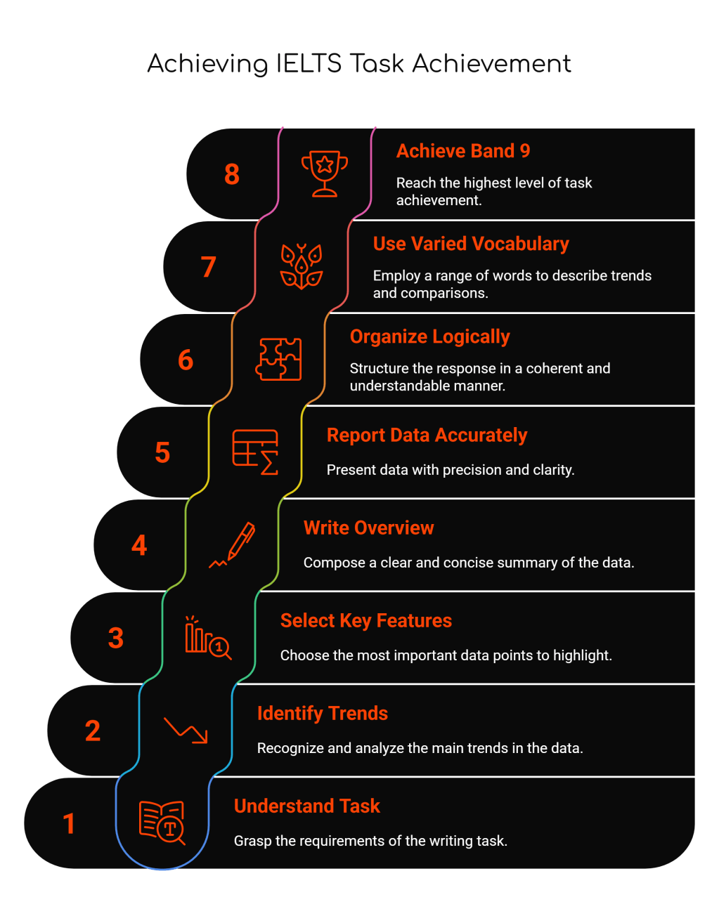
Task Achievement measures how well you fulfill the requirements of the writing task. It evaluates whether you have accurately described the visual information presented (graphs, charts, tables, diagrams, or maps) and addressed all parts of the question effectively.
The examiner assesses your ability to:
- Present a clear overview of main trends, differences, or stages
- Present and highlight key features with relevant supporting figures
- Cover all requirements of the task
- Present information accurately
Band Score Requirements for Task Achievement
Band 9
- Fully satisfies all requirements of the task
- Clearly presents a fully developed response with a clear overview
- Highlights all key features accurately with precise supporting figures
Band 7-8
- Covers requirements of the task sufficiently
- Presents a clear overview of main trends or stages
- Clearly presents key features with relevant supporting figures
Band 5-6
- Generally addresses the task requirements
- Presents an overview with some development
- Presents key features but may be unclear or inaccurate at times
Band 3-4
- Attempts to address the task but may miss key requirements
- Lacks a clear overview
- Presents some key features but with significant inaccuracies
Essential Components for High Task Achievement
1. The Overview Statement
This is arguably the most critical element. Your overview should:
- Identify the most significant trends or patterns
- Be placed in the introduction or as a separate paragraph
- Avoid specific figures or details
- Provide a general summary of what the data shows
Example Overview for a Line Graph: “Overall, while smartphone usage increased dramatically across all age groups between 2010 and 2020, the growth was most pronounced among elderly users, with young adults maintaining consistently high usage throughout the period.”
2. Key Feature Selection
Identify and describe the most important features:
- Highest and lowest values
- Significant increases or decreases
- Notable similarities or differences
- Starting and ending points
- Turning points or unusual patterns
3. Accurate Data Reporting
- Use precise figures from the visual
- Include units of measurement
- Report data accurately without misreading the chart
- Use approximation language when exact figures aren’t clear
Common Task Types and Approach Strategies
Line Graphs
- Focus on trends over time
- Describe rises, falls, fluctuations, and stability
- Compare different lines/categories
- Identify intersections and divergences
Bar Charts
- Compare quantities across categories
- Highlight the highest and lowest values
- Group similar categories when appropriate
- Note any significant gaps between categories
Pie Charts
- Focus on proportions and percentages
- Identify the largest and smallest segments
- Compare multiple pie charts if provided
- Note any significant changes in proportions
Tables
- Identify patterns in rows and columns
- Compare figures across different categories
- Highlight extremes and notable figures
- Look for relationships between different variables
Process Diagrams
- Describe each stage clearly and sequentially
- Use appropriate sequencing language
- Explain the purpose of each step
- Identify the beginning and end of the process
Essential Dos and Don’ts
✅ DO:
- Write a clear overview – This is essential for bands 6 and above
- Select key features strategically – Focus on the most significant data points
- Use accurate figures – Always support descriptions with precise data
- Organize logically – Group related information together
- Use varied vocabulary – Employ different words to describe trends and comparisons
- Stay objective – Report what you see without personal opinions
- Check word count – Aim for 150-200 words (minimum 150)
❌ DON’T:
- Include irrelevant information – Stick to what’s shown in the visual
- Give opinions or explanations – Don’t speculate about reasons behind the data
- Copy the question – Paraphrase the task description
- Describe every single detail – Focus on key features only
- Misread the data – Double-check figures and trends
- Ignore time periods – Always note the timeframe if provided
- Forget units – Include percentages, currencies, measurements as shown
Common Mistakes and How to Fix Them
Mistake 1: No Clear Overview
Problem: Jumping straight into detailed description without providing a general summary.
Fix: Always include an overview that summarizes the main trends or patterns. Place it either at the end of your introduction or as a separate second paragraph.
Example Fix: ❌ “The graph shows smartphone usage from 2010 to 2020. In 2010, teenagers used smartphones for 2 hours daily.”
✅ “The graph shows smartphone usage from 2010 to 2020. Overall, usage increased across all age groups, with the most significant growth occurring among elderly users.”
Mistake 2: Including Irrelevant Details
Problem: Describing every minor fluctuation instead of focusing on key features.
Fix: Select only the most significant trends and data points.
Example Fix: ❌ “Usage went from 2 to 2.1 to 2.05 to 2.2 to 2.3 hours…”
✅ “Usage increased steadily from 2 hours in 2010 to approximately 4.5 hours by 2020.”
Mistake 3: Inaccurate Data Reporting
Problem: Misreading charts or providing incorrect figures.
Fix: Double-check all figures and use approximation language when exact numbers aren’t clear.
Example Fix: ❌ “Sales reached exactly 45% in March.” (when the chart shows approximately 47%)
✅ “Sales reached approximately 47% in March.”
Mistake 4: Lack of Comparisons
Problem: Describing data in isolation without making relevant comparisons.
Fix: Compare different categories, time periods, or data sets shown.
Example Fix: ❌ “Country A had 30% unemployment. Country B had 15% unemployment.”
✅ “Country A had significantly higher unemployment at 30% compared to Country B’s 15%.”
Sample Response Analysis
Task: The line graph shows the percentage of households with internet access in three countries from 2000 to 2015.
Band 9 Response Structure:
Introduction + Overview: “The line graph illustrates the proportion of households with internet connectivity in the USA, UK, and Germany between 2000 and 2015. Overall, all three countries experienced substantial growth in internet penetration, with the USA leading throughout most of the period, though Germany showed the most dramatic increase.”
Body Paragraph 1: “In 2000, internet access varied considerably among the three nations. The USA had the highest penetration at approximately 45%, followed by the UK at around 30%, while Germany lagged significantly behind at just 15%. This gap persisted through the early 2000s, with all countries showing steady upward trends.”
Body Paragraph 2: “The period from 2005 onwards saw accelerated growth across all three countries. Germany experienced the most remarkable transformation, with internet access surging from roughly 35% in 2005 to nearly 85% by 2015. Meanwhile, both the USA and UK maintained strong growth, reaching approximately 90% and 88% respectively by the end of the period, effectively converging at similar levels.”
Key Vocabulary for Task Achievement
Describing Trends:
- Increases: rose, climbed, surged, soared, peaked
- Decreases: fell, dropped, declined, plummeted, hit a low
- Stability: remained stable, plateaued, leveled off, stayed constant
- Fluctuation: fluctuated, varied, oscillated
Making Comparisons:
- Higher: exceeded, surpassed, was greater than, dominated
- Lower: lagged behind, was inferior to, fell short of
- Similar: comparable to, similar to, equivalent to, matched
Approximation Language:
- approximately, roughly, around, about, nearly, just over/under, close to
Final Tips for Success
- Practice time management – Spend 20 minutes on Task 1, leaving 40 minutes for Task 2
- Plan before writing – Take 2-3 minutes to analyze the visual and identify key features
- Proofread carefully – Check for accuracy in data reporting and basic errors
- Use the question as a guide – Ensure you address all parts of the task
- Develop template structures – Have a clear format for different chart types
Remember, Task Achievement is about demonstrating that you can accurately interpret and report visual information. Focus on clarity, accuracy, and completeness rather than trying to impress with overly complex language.
Ready to improve your IELTS Writing Task 1 score? Practice identifying key features and writing clear overviews with various chart types. Remember, consistent practice with focused feedback is the key to achieving your target band score.
#IELTSGuidePhil #IELTS #IELTSWriting #IELTSTask1 #IELTSAcademic #TaskAchievement #IELTSPreparation #IELTSTips #IELTSStudy #EnglishTest #IELTSSuccess #WritingSkills #IELTSBand7 #IELTSBand8 #IELTSBand9 #TestPreparation #EnglishLearning #IELTSCoach #StudyTips #IELTSStrategy

Leave a comment