IELTS Academic Writing Task 1 requires you to describe, summarize, or explain visual information in at least 150 words within 20 minutes. This task tests your ability to identify key features, compare data, describe trends, and present information clearly and accurately using appropriate academic language.
Success in Task 1 depends on understanding different chart types, mastering descriptive language patterns, organizing information logically, and managing time effectively while maintaining accuracy and coherence. This comprehensive guide provides everything you need to achieve a high band score in this crucial component of the IELTS Academic Writing test.
Understanding Task 1 Requirements
Task 1 presents visual information that you must describe objectively and systematically. The task requires factual reporting rather than personal opinions, analysis of causes, or speculation about future trends unless explicitly requested.
Your response must be at least 150 words, but aiming for 160-180 words provides sufficient detail while leaving adequate time for the higher-weighted Task 2. Quality matters more than quantity, so focus on accuracy and clarity rather than length.
The 20-minute time allocation requires efficient planning and execution. Spend approximately 2-3 minutes analyzing the visual and planning your response, 15-16 minutes writing, and 1-2 minutes reviewing and editing.
Assessment focuses on four criteria: Task Achievement (25%), Coherence and Cohesion (25%), Lexical Resource (25%), and Grammatical Range and Accuracy (25%). Understanding these criteria helps you focus your preparation and writing approach effectively.
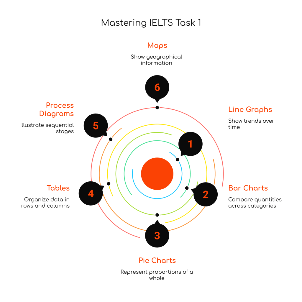
Types of Visual Information
IELTS Task 1 presents various visual formats, each requiring specific descriptive approaches and language patterns for effective communication.
Line Graphs
Line graphs show changes over time, displaying trends, patterns, and fluctuations in data across different periods. They typically feature one or more lines representing different categories, countries, or variables.
Key features to identify include overall trends (increasing, decreasing, stable), significant changes (sharp rises, dramatic falls), peaks and troughs, and points where lines intersect or diverge.
Effective description requires noting starting and ending points, identifying periods of significant change, comparing different lines when multiple categories are present, and highlighting the most notable features rather than describing every minor fluctuation.
Common language patterns include expressions for trends (rose steadily, declined sharply, remained constant), time references (from 2010 to 2020, during the period, by the end of), and comparative structures (while X increased, Y decreased significantly).
Bar Charts
Bar charts compare quantities across different categories at specific time points or compare the same categories across different time periods. They may be vertical (columns) or horizontal bars.
Focus on identifying the highest and lowest values, significant differences between categories, patterns or groupings in the data, and any notable similarities or contrasts between different bars.
Describe the most significant features first, such as the category with the highest value, then compare other categories systematically. Avoid describing every single bar; instead, group similar values or identify clear patterns.
Language should emphasize comparison and contrast, using phrases like “the highest figure was recorded in,” “significantly more than,” “nearly twice as much as,” and “considerably lower than.”
Pie Charts
Pie charts show proportions or percentages of a whole, often comparing compositions at different time points or between different groups. They may appear as single pies or multiple pies for comparison.
Identify the largest and smallest segments, any segments of equal or similar size, and when comparing multiple pies, note significant changes in proportions over time or differences between groups.
Begin with the most significant proportion and work systematically through other segments. When comparing multiple pie charts, focus on the most notable changes rather than describing every segment individually.
Use language expressing proportions such as “accounted for,” “comprised,” “represented,” “made up,” along with fractions (one-third, three-quarters) and percentage expressions (the majority, a small minority).
Tables
Tables present data in rows and columns, often showing information across multiple categories and time periods simultaneously. They require systematic organization to avoid confusion.
Identify patterns in rows and columns separately, noting highest and lowest figures in each category, trends over time periods, and significant differences between categories.
Organize your description logically, perhaps by describing row patterns first, then column patterns, or by focusing on the most significant data points and comparisons.
Use clear referencing language to help readers follow your description: “In terms of,” “Regarding,” “As for,” “Looking at the data for,” and “Turning to.”
Process Diagrams
Process diagrams illustrate how something works, is made, or develops through sequential stages. They show cyclical processes, manufacturing procedures, life cycles, or systems operations.
Focus on the logical sequence of stages, key transformation points, inputs and outputs at each stage, and any cyclical elements or feedback loops in the process.
Use chronological organization, describing stages in the order they occur. Employ appropriate linking language to show sequence and cause-effect relationships.
Language should emphasize sequence (first, next, then, finally), passive voice constructions (is processed, are mixed, is transformed), and process-specific vocabulary related to the particular system being described.
Maps
Maps show geographical information, changes in locations over time, or spatial relationships between different features. They may compare the same area at different time periods or show current layouts.
Identify major features, changes in land use or development, new constructions or demolished buildings, and shifts in transportation or infrastructure.
Organize spatially using directional language (north, south, adjacent to, opposite) and location references (in the center, on the outskirts, along the coast).
Use appropriate geographical and directional vocabulary, passive constructions for changes (was built, has been developed, will be constructed), and clear spatial references.
Language and Grammar Patterns
Mastering specific language patterns is essential for accurately and effectively describing visual information in Task 1.
Describing Trends and Changes
Trend language requires understanding various verbs, nouns, adverbs, and adjectives that describe different types of changes with appropriate intensity and precision.
Upward trends can be described using verbs like rise, increase, grow, climb, soar, rocket, surge, with corresponding nouns like rise, increase, growth, climb, surge. Intensity can be modified with adverbs: gradually, steadily, rapidly, dramatically, sharply.
Downward trends use verbs such as fall, decrease, decline, drop, plummet, plunge, crash, with nouns like fall, decrease, decline, drop, slump. Combine with appropriate adverbs for precise description.
Stable periods require language like remain constant, stay stable, maintain the same level, show little change, plateau, level off, with nouns like stability, plateau, period of stability.
Comparative Language
Effective comparison requires mastery of comparative and superlative structures, expressions of difference, and ways to show relationships between data points.
Use comparative adjectives (higher than, lower than, more significant than) and superlative forms (the highest, the most dramatic, the least significant) to establish relationships between different data points.
Express degrees of difference with phrases like considerably more than, slightly higher than, nearly twice as much as, approximately half the amount of, significantly less than.
Show proportional relationships using expressions such as three times as much as, double the amount of, half the figure for, similar levels to, comparable with.
Time References
Accurate time referencing helps readers understand when changes occurred and provides context for data description.
Use prepositions appropriately: in 2020, during the period, from 2010 to 2015, between 2005 and 2010, by the end of the decade, over the next five years.
Employ time expressions that show sequence: initially, subsequently, thereafter, finally, meanwhile, simultaneously, at the same time.
Reference specific periods: at the beginning of the period, in the middle of the timeframe, towards the end, throughout the entire period.
Numbers and Figures
Present numerical information clearly and accurately using appropriate mathematical language and expressions.
Use approximation language when exact precision isn’t necessary: approximately, roughly, about, just over, nearly, almost, around, close to.
Express fractions and percentages appropriately: one-third, three-quarters, two-fifths, the majority, a minority, a small proportion, a significant percentage.
Present large numbers clearly: 1.5 million, two and a half billion, several hundred thousand, numerous alternatives to avoid repetition.
Task 1 Structure and Organization
Effective Task 1 responses follow a clear organizational pattern that guides readers through the information logically and systematically.
Introduction Paragraph
The introduction should paraphrase the task question, identifying what the visual information shows without copying the exact wording from the prompt.
Identify the type of visual (bar chart, line graph, pie chart), what it measures (population, sales figures, temperature), the time period covered, and the geographical location or categories involved.
Keep introductions concise, typically 1-2 sentences that provide essential context without unnecessary details. Avoid adding interpretation or analysis that belongs in the body paragraphs.
Example approach: “The line graph illustrates changes in household energy consumption across four different sources in the UK between 1990 and 2020.”
Overview Paragraph
The overview presents the most significant general features or trends visible in the data without including specific figures or detailed analysis.
Identify 2-3 main trends or features that characterize the data overall. These might include the overall direction of change, the most significant category, or notable patterns across the time period.
Use general language rather than specific numbers: “overall,” “in general,” “the most noticeable feature,” “it is clear that,” “what stands out is.”
The overview can appear as a separate paragraph after the introduction or as concluding sentences within body paragraphs, depending on your organizational preference and the specific data presented.
Body Paragraphs
Body paragraphs provide detailed description of the data, typically organized by categories, time periods, or most significant features to least significant.
Each paragraph should have a clear focus, such as describing one particular category across time, comparing different categories at specific points, or detailing changes during particular periods.
Include specific figures and data points to support your descriptions, but select the most relevant numbers rather than listing every single figure from the visual.
Use topic sentences to introduce each paragraph’s focus, then develop with supporting details and specific examples from the data.
Logical Progression
Organize information in a way that makes sense to readers, whether chronologically, by category, or by significance of features.
Use appropriate linking words and phrases to connect ideas within and between paragraphs: furthermore, in addition, however, in contrast, similarly, on the other hand.
Ensure smooth transitions between different aspects of the data description, helping readers follow your analysis clearly.
Conclude with the overview if not presented earlier, or ensure your final paragraph provides a sense of completion without unnecessary repetition.
Common Task 1 Mistakes
Understanding frequent errors helps you avoid pitfalls that prevent candidates from achieving higher band scores.
Task Achievement Errors
Many candidates fail to address all aspects of the visual information, focusing too heavily on minor details while missing major trends or significant features.
Avoid providing personal opinions, analysis of causes, or predictions about future trends unless specifically requested in the task prompt.
Don’t copy language directly from the task question; always paraphrase the introduction using your own words while maintaining accuracy.
Ensure you meet the minimum word count of 150 words, but avoid excessive length that consumes time needed for Task 2.
Language and Grammar Issues
Overuse of basic vocabulary and repetitive language patterns can limit your Lexical Resource score. Develop varied ways to express similar concepts.
Accuracy with numbers, percentages, and mathematical expressions is crucial. Practice writing figures clearly and using appropriate mathematical language.
Tense usage must be appropriate for the time periods shown in the data. Use past tense for historical data, present tense for current information, and future tense only when data shows projections.
Article usage (a, an, the) and preposition accuracy significantly affect grammar scores, particularly with time expressions and numerical references.
Organization Problems
Poor paragraph structure and unclear progression of ideas can significantly impact Coherence and Cohesion scores.
Inadequate or missing overview sections fail to demonstrate your ability to identify main features and overall trends.
Insufficient linking language makes responses difficult to follow and reduces coherence.
Inconsistent organizational approach within responses can confuse readers and reduce overall effectiveness.
Preparation Strategies
Systematic preparation using varied techniques ensures comprehensive skill development and confidence building for Task 1 success.
Analyze Authentic Visuals
Study charts, graphs, and diagrams from newspapers, academic journals, government reports, and business publications to familiarize yourself with different visual formats and data presentation styles.
Practice identifying main features, trends, and significant data points in various types of visual information before attempting to write descriptions.
Develop speed in visual analysis, as efficient identification of key features is essential within the 20-minute time constraint.
Build Descriptive Vocabulary
Create systematic vocabulary lists for different aspects of Task 1 writing: trend language, comparative expressions, time references, and numerical descriptions.
Practice using synonyms and varied expressions to avoid repetition while maintaining accuracy and precision.
Study model answers to identify effective language use and incorporate sophisticated vocabulary into your own writing practice.
Timed Writing Practice
Practice writing complete Task 1 responses within 20-minute time limits to develop speed and efficiency under test conditions.
Focus on planning quickly but effectively, spending only 2-3 minutes on analysis and organization before beginning to write.
Develop personal templates or organizational frameworks that can be adapted to different visual types while avoiding overly formulaic responses.
Error Analysis and Correction
Maintain detailed records of your practice writing, identifying recurring errors in grammar, vocabulary, organization, or task achievement.
Work systematically on problem areas, whether they involve specific grammatical structures, vocabulary gaps, or organizational weaknesses.
Seek feedback from qualified teachers or use authentic marking criteria to assess your writing objectively and identify areas for improvement.
Advanced Techniques
Developing sophisticated approaches to Task 1 can help you achieve higher band scores through more effective communication and language use.
Sophisticated Data Grouping
Learn to group related information effectively rather than describing every data point individually. This demonstrates analytical thinking and efficient communication.
Identify patterns, trends, or relationships that allow you to discuss multiple data points together coherently.
Use appropriate language to introduce grouped information: “Several countries showed similar patterns,” “A number of categories experienced comparable changes.”
Complex Sentence Structures
Incorporate varied sentence structures including complex and compound sentences that demonstrate grammatical range while maintaining accuracy.
Use participial phrases, relative clauses, and conditional structures where appropriate to show sophisticated grammar use.
Balance complexity with clarity, ensuring that sophisticated structures enhance rather than obscure meaning.
Precise Mathematical Language
Develop facility with mathematical expressions, fractions, percentages, and proportional language that demonstrates academic register.
Learn to express approximations, ranges, and comparative relationships with precision and variety.
Practice mathematical language in context rather than memorizing isolated expressions, ensuring natural and appropriate usage.
Task 1 by Chart Type: Specific Strategies
Each visual format requires specific approaches and language patterns for optimal description and analysis.
Line Graph Strategies
Focus on overall trends first, then describe significant changes, peaks, valleys, and intersections between different lines.
Use appropriate time sequencing language to guide readers through chronological changes clearly.
Compare different lines systematically, highlighting similarities, differences, and points of convergence or divergence.
Select the most significant data points rather than describing every fluctuation, maintaining focus on major trends and changes.
Bar Chart Approaches
Begin with the most striking comparisons, such as the highest and lowest values, then work systematically through other significant features.
Group similar values when appropriate rather than describing each bar individually, demonstrating analytical thinking.
Use clear comparative language to establish relationships between different categories or time periods.
Organize by logical criteria such as size order, chronological sequence, or categorical groupings.
Pie Chart Techniques
Start with the largest segment and work systematically through others, using proportional language effectively.
When comparing multiple pie charts, focus on the most significant changes in proportions rather than describing every segment.
Use varied vocabulary for proportions and percentages to demonstrate lexical resource.
Connect proportion descriptions to overall themes or patterns visible across the charts.
Process Description Methods
Follow the logical sequence of stages systematically, using appropriate sequential and causal language.
Employ passive voice constructions naturally and accurately, as processes often focus on actions rather than agents.
Use technical vocabulary appropriately when describing specialized processes, while ensuring clarity for general readers.
Connect stages clearly using linking language that shows relationships and progression.
Map Description Techniques
Use clear spatial organization, perhaps describing changes by geographical area or by type of development.
Employ accurate directional and positional language to help readers understand geographical relationships.
Focus on the most significant changes rather than describing every minor alteration, maintaining perspective on major developments.
Use appropriate tenses for different time periods shown, particularly when comparing past and present or showing projected changes.
Sample Response Analysis
Understanding high-quality responses helps you recognize effective techniques and language use that characterize successful Task 1 writing.
Effective responses demonstrate clear task achievement by addressing all aspects of the visual information while maintaining focus on description rather than analysis or opinion.
Strong coherence and cohesion appear through logical organization, appropriate paragraphing, and effective use of linking language that guides readers smoothly through the information.
Lexical resource is evident in varied vocabulary, accurate use of technical terms, appropriate register, and natural expressions that avoid repetition while maintaining precision.
Grammatical range and accuracy show through varied sentence structures, appropriate tense usage, accurate mathematical expressions, and error-free communication that supports rather than hinders meaning.
Test Day Performance
Effective test day execution requires preparation beyond writing skills, including practical strategies for optimizing performance under actual test conditions.
Time Management on Test Day
Allocate your 20 minutes systematically: 2-3 minutes for analysis and planning, 15-16 minutes for writing, and 1-2 minutes for review and editing.
Avoid spending excessive time on Task 1 at the expense of Task 2, which carries twice the weight in your overall Writing band score.
Practice writing with timing awareness during preparation so that internal pacing becomes automatic during the actual test.
Visual Analysis Speed
Develop efficient techniques for quickly identifying key features, main trends, and significant data points within the first few minutes.
Practice rapid visual scanning to locate the most important information that should form the basis of your response.
Learn to distinguish between major features that must be included and minor details that can be omitted due to time constraints.
Writing Efficiency
Develop personal organizational frameworks that can be quickly adapted to different visual types without becoming overly formulaic.
Practice writing clearly and legibly under time pressure, as illegible responses cannot be assessed accurately.
Build confidence with various chart types through extensive practice, reducing decision-making time during the actual test.
Conclusion
Mastering IELTS Academic Writing Task 1 requires understanding diverse visual formats, developing appropriate descriptive language, organizing information effectively, and managing time efficiently within the constraints of the test environment.
Success depends on building genuine analytical and descriptive writing skills while familiarizing yourself with specific task requirements and assessment criteria. Regular practice with authentic materials, combined with systematic vocabulary development and grammar improvement, provides the foundation for achieving your target band score.
Remember that Task 1 skills transfer directly to academic and professional contexts where clear, accurate description of data and visual information is essential. The ability to analyze charts, describe trends, and present information objectively serves you well in university studies, research presentations, and professional communications.
Approach your preparation systematically, focusing on accuracy and clarity while developing the speed and efficiency necessary for test success. With dedicated practice using varied visual formats and consistent attention to language development, you can achieve the Task 1 performance needed to support your overall IELTS Academic Writing goals.
The investment in developing these analytical and descriptive writing skills will benefit you throughout your academic and professional career, providing essential capabilities for success in data-driven, evidence-based communication contexts.
#IELTSGuidePhil #IELTSWriting #AcademicEnglish #IELTSTips #IELTSPreparation #IELTSExam #WritingSkills #IELTSWritingTask1 #IELTSBand7 #EnglishProficiency #StudyAbroad #IELTS

Leave a comment