
One of the most challenging aspects of IELTS Academic Writing Task 1 is effectively describing visual information using appropriate vocabulary and phrases. In this post, we’ll explore essential academic vocabulary for describing graphs, charts, and trends that will help you achieve a high band score in your IELTS examination.
Understanding the Task 1 Challenge
In IELTS Academic Writing Task 1, you are asked to describe visual information presented in graphs, charts, tables, or diagrams. Your ability to accurately interpret and describe the data using appropriate academic language is crucial for scoring well. Many test-takers struggle with finding varied expressions to describe trends and figures, often repeating the same limited vocabulary throughout their response.
Essential Vocabulary for Introducing Visual Information
When introducing the visual element in your Task 1 response, use these phrases to sound more professional:
- “As can be seen from this graph…”
- “It is shown that…”
- “Drawing the attention to this part of the graph…”
- “Looking more closely at this month’s figures…”
- “This figure refers to the sales in China only.”
- “This pie chart shows the share of the European market today.”
- “As can be seen, the main competitor has an even bigger share.”
- “The bar chart represents sales in Asian outlets.”
- “Here one can see a comparison between…”
Describing Line Graphs Effectively
Line graphs typically show changes over time. Use these expressions to describe what you observe:
- “On the line graph one will note a strong upward trend in the sales of product A…”
- “…despite occasional fluctuations…”
- “…with a slight drop during the holiday season…”
- “…with occasional variations due to…”
- “…the overall performance of product B is good.”
- “The initial surge in sales was followed by a period of slower growth in the second half of the year.”
- “The instant success of the product was followed by a period of stabilization in the level of sales.”
Vocabulary for Describing Trends
Describing Increases
Instead of repeatedly using “increase” or “rise,” consider these alternatives:
- “a slight/constant/marked/substantial increase in sales”
- “an increase of about/roughly/approximately/in the region of… %”
- “a little over/above what we predicted”
- “the recovery/upturn began in (month)”
- “an overall increase in…”
- “an upward trend in the demand for…”
- “sales reached record levels / reached a peak in (month)”
- “a strong surge in the sales of…”
- “by (month), the figure had risen to…”
- “it is predicted that sales will soar in the coming year / over the next… months”
Describing Decreases
To describe downward trends with precision:
- “just under the target”
- “way below expectations”
- “a slight / notable / significant decrease in…”
- “the downturn began in (month)”
- “the situation began to deteriorate in (month)”
- “the number has continued to fall”
Describing Fluctuations
When data shows variation rather than a clear trend:
- “a slow start developed into steady progress in sales”
- “an initial upward trend was followed by…”
- “slight fluctuations through the year were noted”
- “normal seasonal variations are the cause of occasional downward trends”
- “sales have been (rather) irregular”
- “the level / the rate has been unstable since…”
- “one may note a certain instability in the rate of…”
Crafting an Effective Overview
An overview paragraph is essential for Task 1. These phrases help you construct a clear summary:
- “It is clear that…”
- “It can be clearly seen that…”
- “Clearly,”
- “Obviously,”
- “Apparently,”
- “Overall,”
- “Generally,”
- “As a whole,”
- “By and large,”
Beginning Body Paragraphs
To transition smoothly between different aspects of the visual information:
- “Looking at the graph in detail,”
- “In the first/second/third graph”
- “In terms of…”
- “When it comes to…”
- “Meanwhile,”
- “On the other hand,”
Converting Numbers to Words: A Key Academic Skill
One way to demonstrate sophistication in your Task 1 response is to express numerical data in words rather than simply repeating numbers. This chart shows how to convert percentages to proportions or ratios:
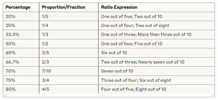
Describing Proportions in Words
For a more natural expression of percentages, use these descriptive terms:
- 100% = All
- 90-99% = Almost all
- 80-89% = Most
- 60-79% = A big majority
- 51-59% = Majority
- 50% = One-half
- Below 50% = The greatest number
Sample Task 1 Response Structure
Let’s put these vocabulary items into a structural framework:
- Introduction: Introduce what the visual represents using appropriate language
- “The bar chart illustrates the proportion of…”
- “As can be seen from the line graph provided…”
- Overview: Provide a summary of the main trends or significant features
- “Overall, it is clear that…”
- “Generally, the most striking feature is…”
- Detail Paragraph 1: Focus on one aspect of the data
- “Looking at the graph in detail, we can see that…”
- “In terms of X, there was a substantial increase…”
- Detail Paragraph 2: Focus on another aspect of the data
- “Meanwhile, the figures for Y show a different pattern…”
- “When it comes to Z, the data indicates a notable fluctuation…”
Common Pitfalls to Avoid
- Overusing basic verbs like “increase” and “decrease” instead of more sophisticated alternatives
- Failing to provide an overview that summarizes the key trends
- Using informal language instead of academic expressions
- Simply listing numbers without interpreting the significance of the data
- Repeating the same phrases throughout your response
Practice Exercise
Look at sample IELTS Task 1 questions and practice using the vocabulary provided in this blog post. Try to:
- Introduce the visual information using at least three different phrases
- Describe upward trends using at least five different expressions
- Describe downward trends using at least three different expressions
- Convert numerical data into words using the proportion/ratio guidelines
Final Thoughts
Mastering academic vocabulary for describing visual information is essential for achieving a high band score in IELTS Writing Task 1. By incorporating the phrases and expressions outlined in this post, you’ll demonstrate lexical resource and task achievement – two key marking criteria for the IELTS writing assessment.
Remember that practicing regularly with a variety of visual data types (line graphs, bar charts, pie charts, tables, and diagrams) will help you become more confident and skilled at selecting the most appropriate language for each situation.
IELTSTask1 #AcademicVocabulary #GraphDescription #IELTSWriting #ChartVocabulary #TrendDescription #IELTSPrep #DataAnalysis #AcademicEnglish #VisualInformation #IELTSGuidePhil #IELTS

Leave a comment