In IELTS Academic Writing Task 1, you are required to describe visual data such as graphs, charts, tables, diagrams, or maps. To score a high band, you must demonstrate a strong grasp of cohesive devices, accurate grammar, data reporting, and formal academic language. This post presents 100 high-level sentence patterns organized by functional use—describing trends, comparisons, figures, changes, processes, maps, and more.
100 Sentence Patterns
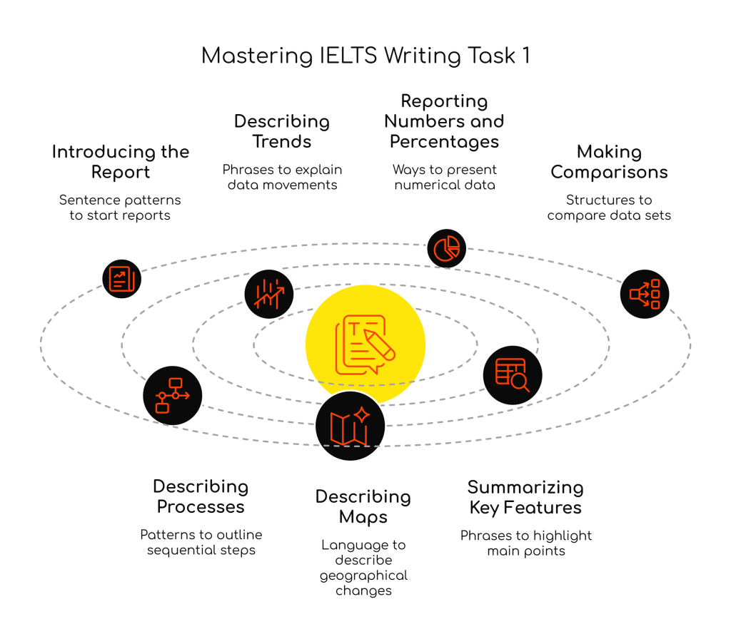
A. Introducing the Report (1–10)
- The graph illustrates the changes in smartphone usage from 2010 to 2020.
- The chart provides information about energy consumption by source.
- The table compares the average income levels in five countries.
- The diagram shows how solar panels generate electricity.
- The figure presents data on student enrollment by faculty.
- The bar chart indicates that car sales increased in 2022.
- The line graph depicts a trend in population growth.
- The pie charts represent the proportion of household spending.
- The given data illustrates the percentage of internet users by region.
- Overall, the visual depicts significant fluctuations in the period shown.
B. Describing Trends (11–30)
- There was a significant increase in oil production in 2015.
- A steady rise can be observed in university applications.
- Sales of electric cars rose sharply from 2018 to 2020.
- The number of commuters declined gradually over a decade.
- The data reveals a sharp drop in rainfall in July.
- A slight fluctuation occurred in unemployment rates.
- There was a dramatic fall in housing prices.
- The trend remained relatively stable throughout the year.
- This figure peaked at 85% in June.
- The lowest point was recorded in December.
- There was a moderate increase in online shopping.
- A gradual upward trend was noted in student performance.
- The growth leveled off after 2012.
- It reached a plateau at 75%.
- This figure remained unchanged from 2010 to 2013.
- It experienced a sudden surge in May.
- The trend reversed after a peak in 2017.
- There was a consistent decline in smoking rates.
- A slight decrease was noted in air travel.
- The amount fluctuated between 40% and 60%.
C. Reporting Numbers and Percentages (31–50)
- The number rose to 4 million in 2020.
- It fell by 15% over the decade.
- There was an increase of 20%.
- It dropped to just under 30%.
- The figure reached approximately 65%.
- The percentage remained steady at 50%.
- The data stood at 70% in 2005.
- It doubled from 10 to 20 units.
- It grew by one-third.
- The quantity tripled over five years.
- A slight difference of 5% was noted.
- The figure was marginally higher than…
- It accounted for nearly a quarter.
- Over half of the population…
- Just under one-fifth of the group…
- The proportion was significantly lower.
- There was a disparity of 10%.
- An estimated 300,000 people…
- Roughly 75% of respondents…
- The total figure reached 10,000.
D. Making Comparisons (51–70)
- X was higher than Y in all years.
- X experienced more growth than Y.
- Y lagged behind X throughout the period.
- The most significant difference was seen in…
- X remained consistently greater than Y.
- X overtook Y in 2012.
- In contrast, Y declined steadily.
- Both X and Y followed a similar trend.
- While X increased, Y remained stable.
- X was nearly twice as high as Y.
- The difference between the two categories widened.
- A closer look reveals that…
- Unlike X, Y showed a downward trend.
- X was slightly more popular than Y.
- The gap between them narrowed by 2020.
- X and Y had equal values in 2010.
- Compared to Y, X performed better.
- X and Y diverged after 2015.
- The figures for X and Y converged.
- Y was marginally below X.
E. Describing Processes (71–80)
- The process begins with heating the raw materials.
- In the next stage, the liquid is filtered.
- Following this, the substance is cooled.
- The materials are then combined in a mixing tank.
- After that, the mixture is poured into moulds.
- Subsequently, the product is packaged.
- Finally, the goods are distributed to stores.
- At this point, the item is complete.
- The entire process involves six steps.
- Each stage plays a vital role in the system.
F. Describing Maps (81–90)
- The area underwent major changes.
- The town expanded significantly.
- The road was replaced with a new highway.
- New buildings were constructed in the north.
- The factory was relocated to the east.
- A park was added near the center.
- Residential zones were enlarged.
- Some shops were demolished.
- The layout of the area changed considerably.
- A school was introduced in the southern region.
G. Summarizing Key Features (91–100)
- Overall, the most striking feature is the growth in sales.
- The data clearly shows that internet access rose sharply.
- One noticeable trend is the decline in fossil fuel use.
- To summarise, X was dominant.
- It is evident that Y declined over time.
- The main difference lies in…
- The chart highlights a contrast between…
- The graph demonstrates the dominance of…
- There was a clear upward/downward trajectory.
- The key takeaway is the steady increase in X.
Final Thoughts
Mastering a wide range of sentence patterns is crucial for achieving high band scores in IELTS Academic Writing Task 1. Use these patterns to structure your writing logically, describe data accurately, and demonstrate grammatical range and lexical flexibility. Regular practice using real visuals will help you internalize these structures and apply them naturally on exam day.
#IELTSWriting #IELTSBand9 #WritingTask1 #AcademicWriting #IELTSPreparation #GrammarForIELTS #SentenceStructures #IELTSGuidePhil #WritingTips #IELTSBlog #IELTS

Leave a comment