Pie charts are frequently used in IELTS Academic Writing Task 1 to present proportional data. To score Band 7.0 or above, candidates must effectively describe comparative percentages, use varied sentence structures, and apply precise vocabulary. This guide offers a model task, a Band 7.0 response, and analysis of language features to help you write like a high scorer.
Sample Task Description
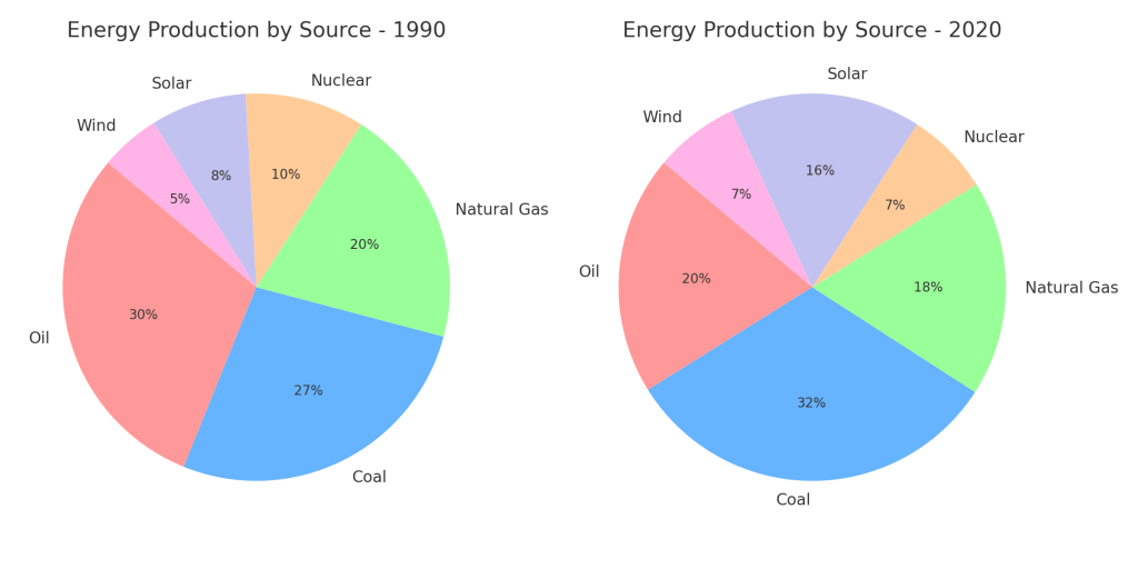
The pie charts below show the distribution of energy production in a country in 1990 and 2020.
Summarize the information by selecting and reporting the main features, and make comparisons where relevant.
Write at least 150 words.
Band 7.0 Sample Answer
The two pie charts compare how energy was produced in a particular country in 1990 and 2020, based on six different sources.
Overall, fossil fuels—specifically coal, oil, and gas—accounted for the majority of energy production in both years. However, while coal remained a dominant source, there was a noticeable shift toward renewable energy by 2020.
In 1990, oil represented the largest share at 30%, followed closely by coal at 27%. Natural gas accounted for 20%, while nuclear and solar energy contributed relatively modest proportions, at 10% and 8%, respectively. Wind energy was the least utilized, comprising just 5% of total production.
By 2020, coal had overtaken oil, rising to 32%, whereas oil’s share declined to 20%. Natural gas remained relatively stable at 18%. In contrast, solar energy usage doubled to 16%, becoming the third-largest source. Wind also increased marginally to 7%, while nuclear energy saw a slight reduction to 7%.
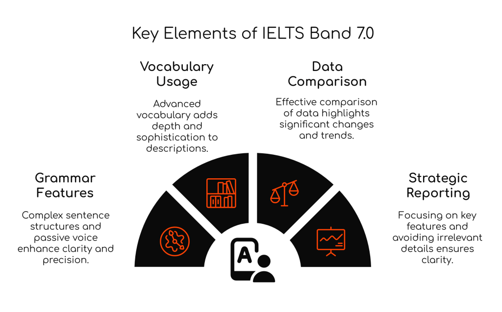
High-Level Grammar Features Explained
1. Complex Sentence Structures
Used to express relationships between data and categories:
Although oil was dominant in 1990, coal surpassed it by 2020.
2. Passive Voice
Ideal for describing processes or distributions:
The two pie charts compare how energy was produced…
3. Comparative and Superlative Forms
Coal became the largest source, solar became the third-largest contributor.
4. Time Phrases and Transitions
By 2020, in contrast, while, whereas, compared to 1990
5. Quantifiers and Approximation
A modest proportion, just under a third, accounted for approximately 30%
High-Level Vocabulary to Use
| Purpose | Advanced Phrases |
|---|---|
| Describing Proportion | accounted for, comprised, represented |
| Showing Change | rose to, declined to, increased significantly |
| Comparing Data | in contrast, while, whereas, compared to |
| Highlighting Importance | dominant source, primary contributor, marginal role |
| Trends/Patterns | noticeable shift, modest growth, gradual transition |
Sample Vocabulary in Use:
- noticeable shift toward renewable energy
- solar energy usage doubled
- accounted for the majority of energy production
Do’s and Don’ts for Describing Pie Charts
Do:
- Use percentage terms precisely (e.g., “a third”, “almost half”).
- Compare data between the two years/categories.
- Use linking devices to connect ideas clearly.
- Include an introduction, overview, and two body paragraphs.
Don’t:
- Use personal opinions or reasons for the data.
- Overuse simple phrases like “it increased” or “it was big”.
- Ignore significant data changes.
- Describe every segment if some are irrelevant.
Frequently Asked Questions
Q: Should I mention exact percentages or use approximations?
A: Use both—exact percentages for precision and approximations to avoid repetition.
Q: Can I describe every category in the pie charts?
A: Focus on key features and noteworthy comparisons. It’s better to group minor details.
Q: Is it okay to use the same structure repeatedly?
A: No. Use varied sentence structures to demonstrate grammatical range.
Top Tips for Band 7.0
- Group categories that are similar in size or change.
- Use high-level comparative language.
- Don’t just report—analyze and compare.
- Practice describing visuals using past data and prediction-based tasks.
Final Thoughts
Pie charts may look simple, but producing a Band 7.0 response requires careful data selection, a balanced overview, and academic expression. Mastering high-level grammar and vocabulary ensures your report stands out in clarity, precision, and cohesion. With regular practice and attention to assessment criteria, you can confidently handle any pie chart you encounter on test day.
#IELTSGuidePhil #IELTS #IELTSWriting #IELTSBand7 #IELTSTask1 #PieChartIELTS #AcademicWriting #IELTSVocabulary #IELTSGrammar #IELTSTips #IELTSPreparation

Leave a comment